



Vanguard Pay
Simplifying complex financial transactions for Gen-Z users.
UI/UX Design
Finance
08 Weeks
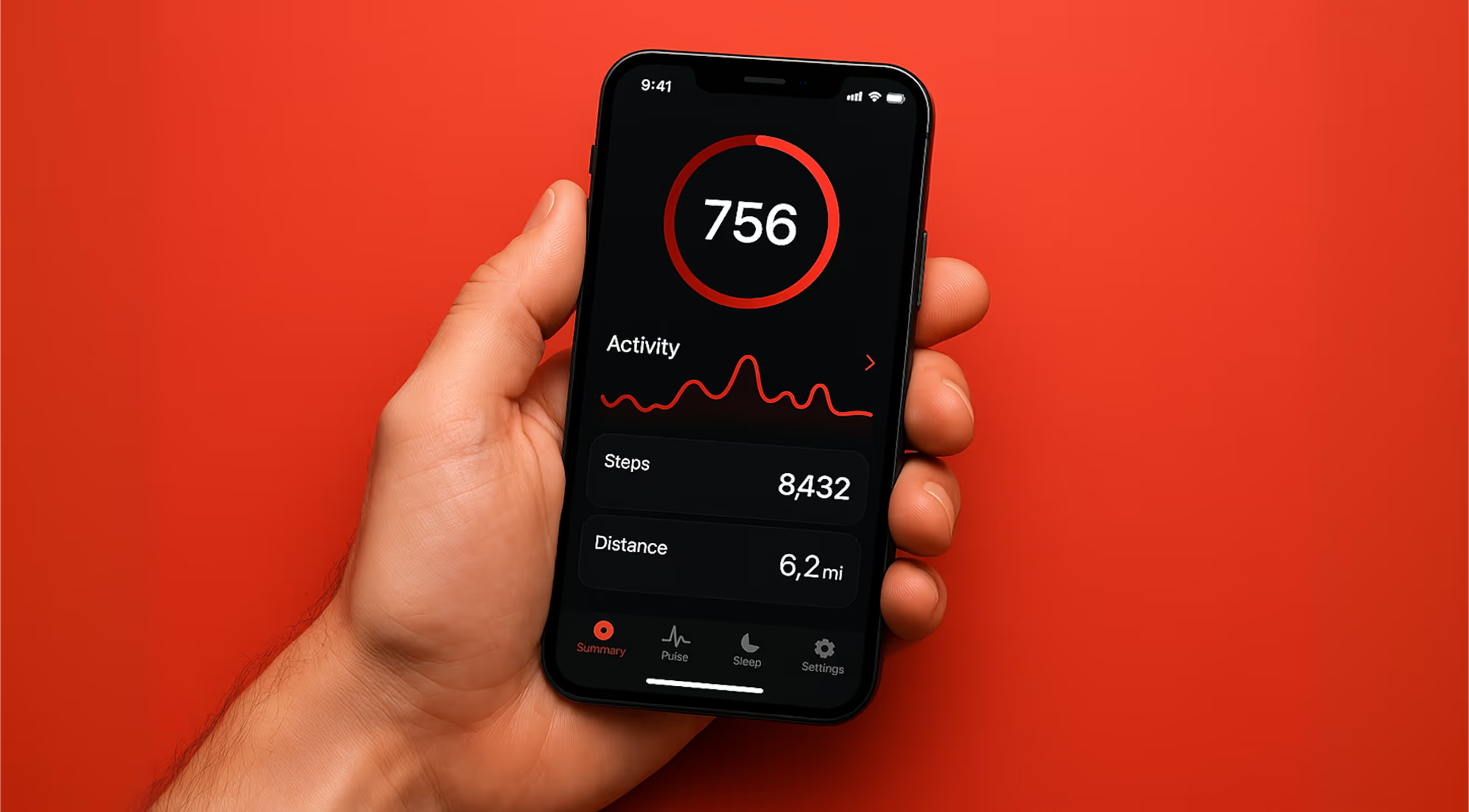
Vanguard Pay had the regulatory approvals and none of the trust. Their audience was eighteen to twenty-six, and the app looked like a bank from 2014.
The problem
Financial products default to a visual language that reads as safe to compliance teams and as condescending to young users. Drop-off happened at the first screen that asked for real money.
What we built
A black-and-acid palette with no stock photography anywhere
Transaction states written in plain language — sent, held, bounced
One primary action per screen, at a size you cannot miss
Hard-edged components that stay legible one-handed on a cracked screen
Result
First-transfer completion up 34%, and support tickets about "where did my money go" down by half.


Lets Go
Got a Brief?
Let's Make

Noise!

Tell us about your project, your team and your timeline. We reply to every serious brief within one business day.


Contact
BUILT — LOUD

Powered by Framer


Designed by Syntrofy